@hiber3d/hdk-react
Table of contents
Type Aliases
- AssetIDOptions
- BloomOptions
- ColorGradingOptions
- CubeMapFace
- CubeMapOptions
- FogOptions
- HDKComponentArgs
- HDKElementArgs
- MetadataProps
- SunOptions
- WeatherOptions
Functions
- AndGate
- Animation
- Apply
- Audio
- ButtonSensor
- CapacitorSensor
- Environment
- GLB
- GameplaySettings
- HttpOnSignal
- HttpSensor
- InfoPanel
- InvisibleOnSignal
- LatchGate
- LogicGate
- LookAtSensor
- LookAtSphereSensor
- MatchStateSensor
- MaterialOnSignal
- MultiInputGate
- NandGate
- NorGate
- NotGate
- OrGate
- PointLight
- PowerUp
- Prefab
- PrefabSpawner
- ProximitySensor
- Random
- ResetOnSignal
- ResistorSensor
- SetMatchStateOnSignal
- SignalListener
- SpawnPrefabOnSignal
- SpotLight
- Temporary
- Text
- VisibleOnSignal
- XnorGate
- XorGate
Animations
Animation
Animation(animation): HDK React Component
Makes children animate.
Parameters
| Name | Type |
|---|---|
animation | AnimationValues & AnimationOptions & { steps?: number[]; easing?: common.EasingType } |
Returns
HDK React Component
See
- Fundamentals (opens in a new tab) for basic component placement.
- Animations (opens in a new tab) for general info about animations.
- Signals (opens in a new tab) for info about signals.
Assets
AssetIDOptions
AssetIDOptions: Object
Used to specify the id of the skybox, reflection box and light box assets for an Environment.
Type declaration
| Name | Type |
|---|---|
lightboxID? | LiteralUnion<CubeMapID, string> |
reflectionboxID? | LiteralUnion<CubeMapID, string> |
skyboxID? | LiteralUnion<CubeMapID, string> |
BloomOptions
BloomOptions: Object
Options for bloom effects in an Environment.
Type declaration
| Name | Type |
|---|---|
blendAlpha? | number |
brightThreshold? | number |
ColorGradingOptions
ColorGradingOptions: Object
Color grading configuration options for an Environment.
Type declaration
| Name | Type |
|---|---|
brightness? | number |
contrast? | number |
hue? | number |
saturation? | number |
tintBlue? | float3 |
tintGreen? | float3 |
tintRed? | float3 |
CubeMapFace
CubeMapFace: Object
Configuration for a face of a cubemap texture.
Type declaration
| Name | Type |
|---|---|
url | string |
CubeMapOptions
CubeMapOptions: Object
Specifies the URLs for the six faces of a cubemap texture.
Type declaration
| Name | Type |
|---|---|
back | CubeMapFace |
bottom | CubeMapFace |
front | CubeMapFace |
left | CubeMapFace |
right | CubeMapFace |
top | CubeMapFace |
FogOptions
FogOptions: Object
Configuration options for fog effects in an Environment.
Type declaration
| Name | Type |
|---|---|
color? | Color |
density? | number |
height? | number |
invert? | boolean |
skyboxAlpha? | number |
skyboxGradient? | number |
SunOptions
SunOptions: Object
Represents options for configuring the sun in an Environment.
Type declaration
| Name | Type |
|---|---|
color? | Color |
exposureLuminanceAvg? | number |
position? | Vec3 |
strength? | number |
WeatherOptions
WeatherOptions: Pick<EnvironmentOptions, "weather">
Options for weather configuration in an Environment.
Audio
Audio(attenuationModel, enabled, looping, maxAttenuationDist, minAttenuationDist, playOnSignal, playSpeed, rollOffFactor, solo, soundType, src, startPlayingDist, volume): HDK React Component
Add an audio source, either an audio preset or an external url. An audio source can be added to any object, or to a point in space.
Parameters
| Name | Type | Description |
|---|---|---|
attenuationModel | common.AudioAttenuationModel | The way sound changes as you move around. NO_ATTENUATION, INVERSE_DISTANCE, EXPONENTIAL_DISTANCE or the default LINEAR_DISTANCE |
enabled | boolean | false means the audio is absent from the scene. |
looping | boolean | false means the sound will only play once, otherwise it will repeat. |
maxAttenuationDist | number | The maximum distance the sound can be heard, defaults to 20. |
minAttenuationDist | number | The minimum distance the sound can be heard, defaults to 5. |
playOnSignal | SignalListenerReference & PlayAudioOnSignalSoloProps | If defined, uses a signal to toggle playing the sound. |
playSpeed | number | - |
rollOffFactor | number | How fast the sound tapers away. |
solo | boolean | true means all other sounds are paused while playing this one. |
soundType | common.SoundType | - |
src | AudioSource | The source of the sound, either an id or an external url. |
startPlayingDist | number | The distance at which the sound starts playing, defaults to 20.1. |
volume | number | The volume of the sound, defaults to 2. |
Returns
HDK React Component
See
- Fundamentals (opens in a new tab) for basic component placement.
- Sound (opens in a new tab) for sound options.
Example
<Audio src={{ id: "a_am_city_01" }} volume={3} />Environment
Environment(assetIDs, bloom, colorGrading, extendEnvironment, fog, id, lightboxBrightness, reflectionboxBrightness, skybox, skyboxBrightness, skyboxSaturation, sun, weather): HDK React Component
Registers an environment for rendering scenes.
Parameters
| Name | Type | Description |
|---|---|---|
assetIDs | AssetIDOptions | Ids for skybox, reflection box, and light box assets. |
bloom | BloomOptions | Options for bloom's bright threshold and blend alpha. |
colorGrading | ColorGradingOptions | Options for color grading's hue, saturation, brightness, contrast, and tint colors. |
extendEnvironment | EnvironmentId | id of the environment to extend. |
fog | FogOptions | Options for fog's color, density, height, inversion, and skybox effects. |
id | string | The id of the environment. |
lightboxBrightness | number | - |
reflectionboxBrightness | number | - |
skybox | CubeMapOptions | URLs for each side of the skybox. |
skyboxBrightness | number | - |
skyboxSaturation | number | - |
sun | SunOptions | Options for sun's position, color, strength, and exposure luminance. |
weather | Weather | Settings for the weather, refer to WeatherPresets. |
Returns
HDK React Component
See
Fundamentals (opens in a new tab) for basic component placement.
Example
const World = () => (
  <HNode>
    <Prefab id={'sphere_01'} scale={3} scaleY={1.5} y={-3} material={'chrome'} />
    <Environment
      id="my_env"
      sun={{
        position: [-1, 1, 1],
        color: '#63c5ea',
      }}
      fog={{
        color: '#63c5ea',
        density: 0.0000001,
      }}
      weather={WeatherPresets.dandelion}
      skybox={{
        back: { url: 'https://cdn.hibervr.com/skybox_cubemaps/underwater_realm/cube_back.png' },
        bottom: { url: 'https://cdn.hibervr.com/skybox_cubemaps/underwater_realm/cube_down.png' },
        front: { url: 'https://cdn.hibervr.com/skybox_cubemaps/underwater_realm/cube_front.png' },
        left: { url: 'https://cdn.hibervr.com/skybox_cubemaps/underwater_realm/cube_left.png' },
        right: { url: 'https://cdn.hibervr.com/skybox_cubemaps/underwater_realm/cube_right.png' },
        top: { url: 'https://cdn.hibervr.com/skybox_cubemaps/underwater_realm/cube_up.png' },
      }}
    />
  </HNode>
);
render(<World />, { environment: 'my_env' });
Prefab
Prefab(id, material): HDK React Component
Represents a prefabricated object in the scene.
Parameters
| Name | Type | Description |
|---|---|---|
id | string | The id of the prefab to add. |
material | MaterialId | The material to apply to the prefab. |
Returns
HDK React Component
See
Fundamentals (opens in a new tab) for basic component placement.
Example
<Prefab id="cube_01" />PrefabSpawner
PrefabSpawner(firstSpawnShouldBeInstant, intervalRule, prefabID, resetOnPlayerIntentChanged, resetOnPlayerRespawn, spawnAmount, spawnAmountMax, spawnAmountMin, spawnAmountRule, spawnInterval, spawnIntervalMax, spawnIntervalMin, spawnRule, spawnedAmountLimit, startIdle): HDK React Component
A component that spawns a prefab.
Parameters
| Name | Type | Description |
|---|---|---|
firstSpawnShouldBeInstant | boolean | Whether the first spawn should be instant. Defaults to true. |
intervalRule | common.PrefabSpawnerIntervalRule | The rule that determines how often the spawner should spawn a prefab. Defaults to 'DEFAULT'. |
prefabID | PrefabId | The ID of the prefab to spawn. Optional if using built in prefab id. |
resetOnPlayerIntentChanged | boolean | Whether the spawner should reset when the player changes intent. Defaults to true. |
resetOnPlayerRespawn | boolean | Whether the spawner should reset when the player respawns. Defaults to true. |
spawnAmount | number | The amount of prefabs to spawn. Used when spawnAmountRule = DEFAULT. Defaults to 1. |
spawnAmountMax | number | The maximum amount of prefabs to spawn. Used when spawnAmountRule = RANDOM. Defaults to 0. |
spawnAmountMin | number | The minimum amount of prefabs to spawn. Used when spawnAmountRule = RANDOM. Defaults to 0. |
spawnAmountRule | common.PrefabSpawnAmountRule | The rule that determines how many prefabs should be spawned. Defaults to 'DEFAULT'. |
spawnInterval | number | The interval in seconds between each spawn. Defaults to 1. |
spawnIntervalMax | number | - |
spawnIntervalMin | number | - |
spawnRule | common.PrefabSpawnerSpawnRule | The rule that determines when the spawner should spawn a prefab. Defaults to 'START_WHEN_EMPTY'. |
spawnedAmountLimit | number | The maximum amount of spawned prefabs that exist in the world simultaneously. Defaults to 1. |
startIdle | boolean | Whether the spawner shouldn't spawn a prefab automatically. Defaults to false. |
Returns
HDK React Component
See
Fundamentals (opens in a new tab) for basic component placement.
Example
Spawn a built in prefab
<PrefabSpawner prefabID="cube_01" />Example
Spawn a custom prefab, a spinning hovering cube
<PrefabSpawner y={2} z={2}>
  <Spinning>
    <Hovering>
      <Prefab id="cube_01" />
    </Hovering>
  </Spinning>
</PrefabSpawner>
Temporary
Temporary(lifespan): HDK React Component
A component that provides property context for all children and removes them after a specified lifespan. This component has no placing or rendering capabilities. It is only used to add context to children.
Parameters
| Name | Type | Description |
|---|---|---|
lifespan | number | The lifespan in seconds. |
Returns
HDK React Component
Example
<Temporary lifespan={5}>
  <HNode z={2}>
    <Prefab id="cube_01" />
    <Prefab id="cube_01" x={5} y={2} />
    <Prefab id="cylinder_01" />
  </HNode>
</Temporary>
Text
Text(billboard, color, shadow, size, transparency): HDK React Component
A component that renders text.
Parameters
| Name | Type | Description |
|---|---|---|
billboard | boolean | Whether the text should face the user. |
color | Color | The color of the text. |
shadow | boolean | Whether the text should have a shadow. |
size | number | The size of the text. |
transparency | number | The transparency of the text color. A value between 0 and 1. |
Returns
HDK React Component
Example
<Text billboard size={2} shadow>Hello, world!</Text>Context
Apply
Apply(props): HDK React Component
Provides property context for all children. This is used to provide a default set of props that will be applied to all children. This component has no placing or rendering capabilities. It is only used to add context to children.
Parameters
| Name | Type | Description |
|---|---|---|
props | Omit<MetadataProps & { children?: ReactNode ; key?: null | string | number ; name?: string } & { apply?: (props: MetadataProps & { name?: string | undefined; key?: string | number | null | undefined; children?: ReactNode; } & { engineId?: number | undefined; showAxisMarker?: boolean | undefined; engineProps?: PropertyAsProperties | undefined; apply?: ((props: MetadataProps & ... 2 more ... & DeepPartial<...>) => MetadataProps ...) => MetadataProps & { name?: string | undefined; key?: string | number | null | undefined; children?: ReactNode; } & { engineId?: number | undefined; showAxisMarker?: boolean | undefined; engineProps?: PropertyAsProperties | undefined; apply?: ((props: MetadataProps & ... 2 more ... & DeepPartial<...>) => MetadataProps ... ; engineId?: number ; engineProps?: PropertyAsProperties ; showAxisMarker?: boolean } & DeepPartial<VectorProperties & RotationProperties & ScaleProperties>, "animation"> & AnimationProps | Context to apply. |
Returns
HDK React Component
Example
// Apply x:2 on all nodes named 'arm', even if 'x' is explicitly set.
<Apply props={{ x: 2 }} when={node => node.name === 'arm'}>
  <HNode z={2}>
    <Prefab id="cube_01" name="arm" />
    <Prefab id="cube_01" name="arm" x={5} y={2} />
    <Prefab id="cylinder_01" name="body" />
  </HNode>
</Apply>
Random
Random(seed): HDK React Component
Set a new random seed context for its children.
Since we want to have the same random values every time we render the scene, we need to use a random seed algorithm. This algorithm is based on the seed value that is passed to the Random component and will generate the same random values every time the seed is the same. If you want another set of random values, you can pass another seed value.
To wrap your component in a random seed context is only needed if you want to use another seed context that the default one. In most cases you don't have to use this component.
This component has no placing or rendering capabilities. It is only used to add context to children.
Parameters
| Name | Type | Description |
|---|---|---|
seed | number | The seed value to use for the random seed algorithm. |
Returns
HDK React Component
Example
// Lets create a component that returns a set number of items with random values.
type MyRandomThingProps = {
  numberOfThings?: number;
};

const MyRandomThing: HDKComponent<MyRandomThingProps> = ({ numberOfThings = 10, ...props }) => {
 const things = [];
 const random = useRandom();
 for (let index = 0; index < numberOfThings; index++) {
   things.push(
     <Prefab
       id="rounded_cube_01"
       scaleX={random.range(1, 3)}
       scaleY={random.range(1, 3)}
       scaleZ={random.range(1, 3)}
       x={random.range(-4, 4)}
       y={random.range(0, 8)}
       z={random.range(-4, 4)}
       rotX={random.range(0, 360)}
       rotY={random.range(0, 360)}
       rotZ={random.range(0, 360)}
       material={random.fromArray(['palette_01_green', 'palette_01_red', 'palette_01_blue', 'palette_01_yellow'])}
     />
   );
 }
 return <HNode {...props}>{things}</HNode>;
}

// Now we can use this component in our scene.
// We wrap the component in a <Random> component to set the seed.
<Random seed={42}>
  <MyRandomThing z={10} />
</Random>
};
Gameplay
PowerUp
PowerUp(abilities, spawnerProps): HDK React Component
Add a power up pick up that spawns on an interval. Its children will be the pick up.
Parameters
| Name | Type | Description |
|---|---|---|
abilities | (AbilityId | Omit<AbilityProps, 'id'>)[] | The abilities that will be activated when you pick up the power up. |
spawnerProps | Omit<PrefabSpawner, "prefabID"> | Config for the spawner. |
Returns
HDK React Component
See
Fundamentals (opens in a new tab) for basic component placement.
Example
<PowerUp abilities={["a_consume_increase_speed"]} spawnerProps={{ spawnInterval: 5 }}>
  <Prefab id="gpl_dynamite_01" />
</PowerUp>
Light
PointLight
PointLight(color, lightOnSignal, offset, radius, strength): HDK React Component
Add a point light to the scene.
Parameters
| Name | Type | Description |
|---|---|---|
color | Color | The color of the light, defaults to white. |
lightOnSignal | SignalListenerReference | If specified, use a signal to turn the light on and off. |
offset | types.float3 | - |
radius | number | The radius of the light, defaults to 10. |
strength | number | The strength of the light, defaults to 50. |
Returns
HDK React Component
Warning
Don't place too many lights close to each other, this will cause artifacts.
See
Fundamentals (opens in a new tab) for basic component placement.
Example
<PointLight strength={50} color="#ffff00" radius={10} />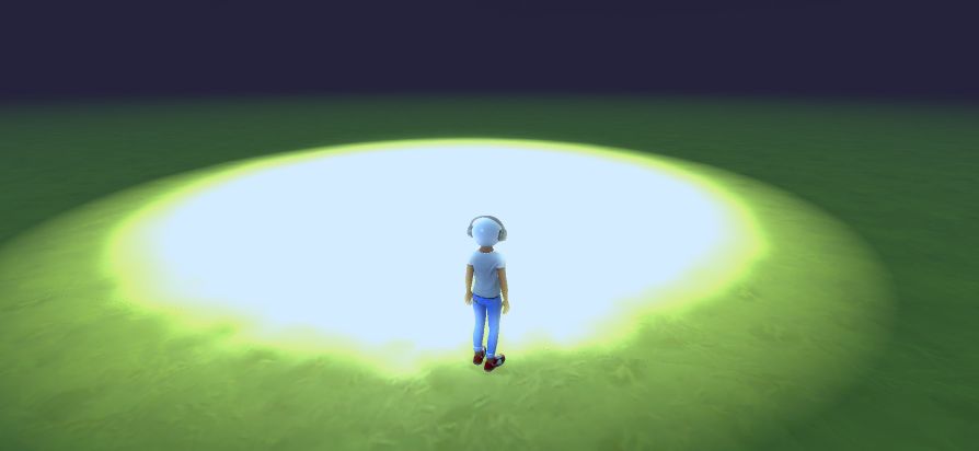
SpotLight
SpotLight(color, dir, lightOnSignal, offset, openingAngleDegs, radius, strength): HDK React Component
Add a spotlight to the scene.
Parameters
| Name | Type | Description |
|---|---|---|
color | Color | The color of the spotlight, defaults to yellow [255, 213, 97]. Warm white |
dir | types.float3 | The direction of the spotlight, defaults is down [0, -1.0, 0]. |
lightOnSignal | SignalListenerReference | Use a signal to turn the light on and off, defaults to undefined. |
offset | types.float3 | The offset of the spotlight, defaults to [0, 0, 0]. |
openingAngleDegs | number | The opening angle of the spotlight, defaults to 130. |
radius | number | The radius of the spotlight, defaults to 10. |
strength | number | The strength of the spotlight, defaults to 25. |
Returns
HDK React Component
Warning
Don't place too many lights close to each other, this will cause artifacts.
See
Fundamentals (opens in a new tab) for basic component placement.
Example
<SpotLight openingAngleDegs={30} radius={200} strength={50} color="#00aeff">
 <Mesh id="en_p_light_cone_02" material={'t_light_cone_01' as Material} y={2.2} rotX={180} physical={false} />
</SpotLight>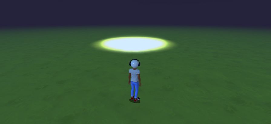
Media
GLB
GLB(collider, material, render, src): HDK React Component
Adds an external GLB Mesh to the scene. Supports GLB format.
Parameters
| Name | Type | Description |
|---|---|---|
collider | boolean | false means the object will be non-physical. |
material | MaterialId | Override the built in material to use for the mesh. |
render | boolean | - |
src | AudioSource | Url of the glb file |
Returns
HDK React Component
See
Fundamentals (opens in a new tab) for basic component placement.
Example
<GLB src="https://cdn.hibervr.com/test/Spheres.glb" y={2} z={3}></GLB>
InfoPanel
InfoPanel(autoOpenOverlay, body, header, imageID, isOpenInNewTabEnabled, isOpenInOverlayEnabled, isOpenInOverlayOnTouch, isSidebarOverlay, maxShowDistance, minShowDistance, openUrlInNewTab, preBody, showOpenBinding, url): HDK React Component
Makes all children show an info panel when looking at them. The info panel can be used to open up a web page for further interaction.
Parameters
| Name | Type | Description |
|---|---|---|
autoOpenOverlay | boolean | - |
body | types.str80 | The body of the info panel, max 80 characters. |
header | string | The header of the info panel. |
imageID | types.TextureID | The icon that should be shown the info panel. |
isOpenInNewTabEnabled | boolean | true if interacting withthe info panel should open the url in a new tab. |
isOpenInOverlayEnabled | boolean | true if opening the url should be in an overlay, if applicable. |
isOpenInOverlayOnTouch | boolean | true if the overlay should be available on touch. |
isSidebarOverlay | boolean | false if the overlay should be shown as a sidebar. |
maxShowDistance | number | The max distance at which the info panel should be shown. |
minShowDistance | number | The min distance at which the info panel should be shown. |
openUrlInNewTab | boolean | true if the url should be opened in a new tab rather than the current. |
preBody | types.str80 | The ingress of the info panel, max 80 characters. |
showOpenBinding | boolean | true if the 'open' binding key should be shown in the panel. |
url | string | The target url for interacting with the panel. |
Returns
HDK React Component
Example
<InfoPanel
     header="Hiber3D Development Kit"
     body="Check out our documentation!"
     url="https://developer.hiber3d.com/docs"
     openUrlInNewTab={true}>
     <Prefab id="hologram_01_hibert" />
   </InfoPanel>
Other
HDKComponentArgs
HDKComponentArgs: HDKElementArgs & { apply?: (props: HDKComponentArgs) => HDKComponentArgs ; engineId?: number ; engineProps?: properties.PropertyAsProperties ; showAxisMarker?: boolean } & TransformProperties
Base props for all placeable HDK React components
HDKElementArgs
HDKElementArgs: MetadataProps & { children?: React.ReactNode ; key?: string | number | null ; name?: string }
Base props for nodes in a HDK React component tree
MetadataProps
MetadataProps: Object
Base metadata props for all HDK React components
Type declaration
| Name | Type |
|---|---|
metadata? | DeepPartial<Metadata> |
GameplaySettings
GameplaySettings(gameplayMatchSettings, gameplayRules, id): HDK React Component
Registers gameplay settings for the world
Parameters
| Name | Type | Description |
|---|---|---|
gameplayMatchSettings | GameplayMatchSettings | - |
gameplayRules | GameplayRule[] | - |
id | string | The id of the gameplay settings, to be referenced as "gameplaySettings" in the render function |
Returns
HDK React Component
HttpOnSignal
HttpOnSignal(input, url): HDK React Component
Component that triggers a HTTP request to a specified url when a signal is activated This component has no placing or rendering capabilities. It is only used to emit signals.
Parameters
| Name | Type | Description |
|---|---|---|
input | SignalId | The signal to listen to |
url | string | The url to request when the signal is activated |
Returns
HDK React Component
See
Signals (opens in a new tab) for more info about signals.
HttpSensor
HttpSensor(output, pollEnabled, pollInterval, url): HDK React Component
Sensor component that activates its signal when it gets a 200 statusCode back from an external url This component has no placing or rendering capabilities. It is only used to emit signals.
Parameters
| Name | Type | Description |
|---|---|---|
output | SignalId | The output signal |
pollEnabled | boolean | Enable polling for an updated status code. Defaults to true |
pollInterval | number | The interval to poll in seconds. Defaults to 10. |
url | string | The url to poll for a status code |
Returns
HDK React Component
See
Signals (opens in a new tab) for more info about signals.
LatchGate
LatchGate(input, output, resetInput): HDK React Component
A Gate that will toggle its output each time the input signal switches from OFF to ON.
Parameters
| Name | Type | Description |
|---|---|---|
input | SignalId | The input signal |
output | SignalId | The output signal that will be toggled |
resetInput | SignalId | An optional signal that will reset the output to OFF |
Returns
HDK React Component
MatchStateSensor
MatchStateSensor(output, state, turnSignalOffNextTick): HDK React Component
Sensor component that activates its signal when the match state enters the given state
Parameters
| Name | Type | Description |
|---|---|---|
output | SignalId | The output signal |
state | SignalMatchState | The state to listen for |
turnSignalOffNextTick | boolean | If true, the signal will be turned off the next tick after it has been turned on |
Returns
HDK React Component
ResetOnSignal
ResetOnSignal(input, resetPlayers, restartLevel): HDK React Component
Component that resets the level and/or players when a signal is activated
Parameters
| Name | Type | Description |
|---|---|---|
input | SignalId | The signal to listen to |
resetPlayers | false | "RESTART" | "RESPAWN" | Whether to reset or respawn the players. Defaults to 'RESTART' |
restartLevel | boolean | Whether to restart the level state. This will reset all animations / signals etc. Defaults to true |
Returns
HDK React Component
SetMatchStateOnSignal
SetMatchStateOnSignal(input, state): HDK React Component
Set the match state when a signal is activated
Parameters
| Name | Type | Description |
|---|---|---|
input | SignalId | The signal to listen to |
state | SignalMatchState | The state to set the match to |
Returns
HDK React Component
Signals
AndGate
AndGate(inputs, output): HDK React Component
Logical AND gate component. The output signal is true if all input signals are true. This component has no placing or rendering capabilities. It is only used to process signals.
Parameters
| Name | Type | Description |
|---|---|---|
inputs | SignalId[] | A list of input signals. At least 2 |
output | SignalId | The output signal. Must be unique |
Returns
HDK React Component
See
Signals (opens in a new tab) for more info about signals.
Example
<ButtonSensor output="myButton1" />
<ButtonSensor output="myButton2" x={2} />
<AndGate output="myOutput" inputs={["myButton1", "myButton2"]} />
<VisibleOnSignal input="myOutput">
  <Prefab id="ancient_urn_01" />
</VisibleOnSignal>
ButtonSensor
ButtonSensor(cooldownInSeconds, durationInSeconds, materialOff, materialOn, maxDistance, meshId, onPress, output, resetInput): HDK React Component
Sensor Component that toggles its output signal ON and OFF when the button is pressed.
Parameters
| Name | Type | Description |
|---|---|---|
cooldownInSeconds | number | The cooldown in seconds after which the button can be pressed again. Defaults to undefined, which means the button can be pressed again immediately. |
durationInSeconds | number | The duration in seconds after which the button will turn off again. Defaults to undefined, which means the button will stay on forever. |
materialOff | MaterialId | The material to use when the output signal is OFF. Defaults to a red material |
materialOn | MaterialId | The material to use when the output signal is ON. Defaults to a green material |
maxDistance | number | The maximum distance at which the button can be pressed. Defaults to 10. |
meshId | MeshId | The mesh to use for the button. Defaults to a button mesh |
onPress | SignalId | A pulse signal output that will be sent when the button is pressed. Useful for resetting other ButtonSensors by setting this output as resetInput prop on them. Optional. |
output | SignalId | The output signal that will be toggled by pressing the button |
resetInput | SignalId | A signal that will reset the button to OFF. Prefarably a pulse since the ButtonSensor will forced to off as long as this signal is on. Defaults to no signal which means it will not be used. |
Returns
HDK React Component
See
Signals (opens in a new tab) for more info about signals.
Example
<Button output="myButton1" />
<VisibleOnSignal input="myButton1">
  <Prefab id="ancient_urn_01" x={2} />
</VisibleOnSignal>
CapacitorSensor
CapacitorSensor(delayInSeconds, input, output): HDK React Component
Sensor Component that delays inactivation of the output signal by a given amount of time. This component has no placing or rendering capabilities. It is only used to emit signals.
Parameters
| Name | Type | Description |
|---|---|---|
delayInSeconds | number | The delay in seconds. Defaults to 1 second. |
input | SignalId | The input signal to listen to |
output | SignalId | The output signal that will have the inactivation delay |
Returns
HDK React Component
See
Signals (opens in a new tab) for more info about signals.
Example
<Button output="myButton1" />
<CapacitorSensor input="myButton1" output="myButton1Delayed" delayInSeconds={2} />
<VisibleOnSignal input="myButton1Delayed">
  <Prefab id="ancient_urn_01" x={2} />
</VisibleOnSignal>
InvisibleOnSignal
InvisibleOnSignal(input): HDK React Component
Component that makes its children invisible when the input signal is true.
Parameters
| Name | Type | Description |
|---|---|---|
input | SignalId | The input signal to listen to |
Returns
HDK React Component
Example
<Button output="myButton1" />
<InvisibleOnSignal input="myButton1">
  <Prefab id="ancient_urn_01" x={2} />
</InvisibleOnSignal>
LogicGate
LogicGate(input1, input2, output, type): HDK React Component
Base logic gate component. The output signal value is determined by the type of gate and the input signals. This component has no placing or rendering capabilities. It is only used to process signals.
Parameters
| Name | Type | Description |
|---|---|---|
input1 | SignalId | An input signal |
input2 | SignalId | Another input signal |
output | SignalId | The output signal. Must be unique |
type | LogicGateType | - |
Returns
HDK React Component
See
Signals (opens in a new tab) for more info about signals.
Example
<ButtonSensor output="myButton1" />
<ButtonSensor output="myButton2" x={2} />
<LogicGate type="AND" output="myOutput" inputs={["myButton1", "myButton2"]} />
<VisibleOnSignal input="myOutput">
  <Prefab id="ancient_urn_01" />
</VisibleOnSignal>
LookAtSensor
LookAtSensor(maxDistance, mesh, minDistance, output, showMesh): HDK React Component
Sensor Component that activates its output signal when looked at by the player. This component has no placing or rendering capabilities. It is only used to emit signals.
Parameters
| Name | Type | Description |
|---|---|---|
maxDistance | number | The maximum distance at which the sensor will activate its output signal. Defaults to 1000 |
mesh | MeshId | The mesh to use for the sensor. Defaults to sphere |
minDistance | number | The minimum distance at which the sensor will activate its output signal. Defaults to 0 |
output | SignalId | The output signal that will be activated when looked at |
showMesh | boolean | true will show the sensor's mesh for debugging purposes. |
Returns
HDK React Component
See
Signals (opens in a new tab) for more info about signals.
Example
<LookAtSensor output="mySignal" mesh="box" />
<VisibleOnSignal input="mySignal">
  <Prefab id="ancient_urn_01" x={2} />
</VisibleOnSignal>
LookAtSphereSensor
LookAtSphereSensor(maxDistance, minDistance, output, showSphere): HDK React Component
Sensor Component that activates its output signal when looked at by the player. This component has no placing or rendering capabilities. It is only used to emit signals.
Parameters
| Name | Type | Description |
|---|---|---|
maxDistance | number | The maximum distance at which the sensor will activate its output signal. Defaults to 1000 |
minDistance | number | The minimum distance at which the sensor will activate its output signal. Defaults to 0 |
output | SignalId | The output signal that will be activated when looked at |
showSphere | boolean | - |
Returns
HDK React Component
See
Signals (opens in a new tab) for more info about signals.
Example
<LookAtSphereSensor output="mySignal" />
<VisibleOnSignal input="mySignal">
  <Prefab id="ancient_urn_01" x={2} />
</VisibleOnSignal>
MaterialOnSignal
MaterialOnSignal(input, materialOff, materialOn): HDK React Component
Component that makes its children change material when the input signal is true.
Parameters
| Name | Type | Description |
|---|---|---|
input | SignalId | The input signal to listen to |
materialOff | MaterialId | The material to apply when the signal is false |
materialOn | MaterialId | The material to apply when the signal is true |
Returns
HDK React Component
Example
<Button output="myButton1" />
<MaterialOnSignal input="myButton1" materialOn="palette_01_black" materialOff="palette_01_white">
  <Prefab id="ancient_urn_01" x={2} />
</MaterialOnSignal>
MultiInputGate
MultiInputGate(inputs, output, renderGate): HDK React Component
Multi-input gate component. The output signal value is determined by the type of gate and the input signals. This component has no placing or rendering capabilities. It is only used to process signals.
Parameters
| Name | Type | Description |
|---|---|---|
inputs | SignalId[] | A list of input signals. At least 2 |
output | SignalId | The output signal. Must be unique |
renderGate | Logic gate factory function | function to use when rendering a gate. |
Returns
HDK React Component
See
Signals (opens in a new tab) for more info about signals.
Example
<ButtonSensor output="myButton1" />
<ButtonSensor output="myButton2" x={2} />
<MultiInputGate type="AND" output="myOutput" inputs={["myButton1", "myButton2"]} />
<VisibleOnSignal input="myOutput">
  <Prefab id="ancient_urn_01" />
</VisibleOnSignal>
NandGate
NandGate(inputs, output): HDK React Component
Logical NAND gate component. The output signal is true as if NOT all input signals are true. This component has no placing or rendering capabilities. It is only used to process signals.
Parameters
| Name | Type | Description |
|---|---|---|
inputs | SignalId[] | A list of input signals. At least 2 |
output | SignalId | The output signal. Must be unique |
Returns
HDK React Component
See
Signals (opens in a new tab) for more info about signals.
Example
<ButtonSensor output="myButton1" />
<ButtonSensor output="myButton2" x={2} />
<NandGate output="myOutput" inputs={["myButton1", "myButton2"]} />
<VisibleOnSignal input="myOutput">
  <Prefab id="ancient_urn_01" />
</VisibleOnSignal>
NorGate
NorGate(inputs, output): HDK React Component
Logical NOR gate component. The output signal is true if all input signals are false. This component has no placing or rendering capabilities. It is only used to process signals.
Parameters
| Name | Type | Description |
|---|---|---|
inputs | SignalId[] | A list of input signals. At least 2 |
output | SignalId | The output signal. Must be unique |
Returns
HDK React Component
See
Signals (opens in a new tab) for more info about signals.
Example
<ButtonSensor output="myButton1" />
<ButtonSensor output="myButton2" x={2} />
<NorGate output="myOutput" inputs={["myButton1", "myButton2"]} />
<VisibleOnSignal input="myOutput">
  <Prefab id="ancient_urn_01" />
</VisibleOnSignal>
NotGate
NotGate(input, output): HDK React Component
Logical NOT gate component. The output signal is true if the input signal is false. This component has no placing or rendering capabilities. It is only used to process signals.
Parameters
| Name | Type | Description |
|---|---|---|
input | SignalId | An input signal to invert |
output | SignalId | The output signal. Must be unique |
Returns
HDK React Component
See
Signals (opens in a new tab) for more info about signals.
Example
<ButtonSensor output="myButton1" />
<NotGate output="myOutput" input="myButton1" />
<VisibleOnSignal input="myOutput">
  <Prefab id="ancient_urn_01" />
</VisibleOnSignal>
OrGate
OrGate(inputs, output): HDK React Component
Logical OR gate component. The output signal is true if any of the input signals are true. This component has no placing or rendering capabilities. It is only used to process signals.
Parameters
| Name | Type | Description |
|---|---|---|
inputs | SignalId[] | A list of input signals. At least 2 |
output | SignalId | The output signal. Must be unique |
Returns
HDK React Component
See
Signals (opens in a new tab) for more info about signals.
Example
<ButtonSensor output="myButton1" />
<ButtonSensor output="myButton2" x={2} />
<OrGate output="myOutput" inputs={["myButton1", "myButton2"]} />
<VisibleOnSignal input="myOutput">
  <Prefab id="ancient_urn_01" />
</VisibleOnSignal>
ProximitySensor
ProximitySensor(maxDistance, minDistance, output, showMaxDistance): HDK React Component
Sensor Component that activates its output signal when the player gets close enough. This component has no placing or rendering capabilities. It is only used to emit signals.
Parameters
| Name | Type | Description |
|---|---|---|
maxDistance | number | The maximum distance at which the sensor will activate its output signal. Defaults to 1000 |
minDistance | number | The minimum distance at which the sensor will activate its output signal. Defaults to 0 |
output | SignalId | The output signal that will be activated when looked at |
showMaxDistance | boolean | true will show the sensor's distance trigger for debugging purposes. |
Returns
HDK React Component
See
Signals (opens in a new tab) for more info about signals.
Example
<HNode x={10}>
  <ProximitySensor output="mySignal" />
  <Prefab id="cube_01" />
</HNode>
<VisibleOnSignal input="mySignal">
  <Prefab id="ancient_urn_01" x={2} />
</VisibleOnSignal>
ResistorSensor
ResistorSensor(delayInSeconds, input, output): HDK React Component
Sensor Component that delays activation of the output signal by a given amount of time. This component has no placing or rendering capabilities. It is only used to emit signals.
Parameters
| Name | Type | Description |
|---|---|---|
delayInSeconds | number | The delay in seconds. Defaults to 1 second. |
input | SignalId | The input signal to listen to |
output | SignalId | The output signal that will have the activation delay |
Returns
HDK React Component
See
Signals (opens in a new tab) for more info about signals.
Example
<Button output="myButton1" />
<ResistorSensor input="myButton1" output="myButton1Delayed" delayInSeconds={2} />
<VisibleOnSignal input="myButton1Delayed">
  <Prefab id="ancient_urn_01" x={2} />
</VisibleOnSignal>
SignalListener
SignalListener(input): HDK React Component
Represents a component signal input source, as a composite part of a listener.
Parameters
| Name | Type | Description |
|---|---|---|
input | SignalId | The input signal |
Returns
HDK React Component
See
Signals (opens in a new tab) for more info about signals.
SpawnPrefabOnSignal
SpawnPrefabOnSignal(id, input): HDK React Component
Component that spawns a prefab at this objects position when the input signal is true.
Parameters
| Name | Type | Description |
|---|---|---|
id | string | The prefab ID to spawn |
input | SignalId | The input signal to listen to |
Returns
HDK React Component
Example
<Button output="myButton1" />
<SpawnPrefabOnSignal input="myButton1" id="balloons_01" />
VisibleOnSignal
VisibleOnSignal(input): HDK React Component
Component that makes its children visible when the input signal is true.
Parameters
| Name | Type | Description |
|---|---|---|
input | SignalId | The input signal to listen to |
Returns
HDK React Component
Example
<Button output="myButton1" />
<VisibleOnSignal input="myButton1">
  <Prefab id="ancient_urn_01" x={2} />
</VisibleOnSignal>
XnorGate
XnorGate(inputs, output): HDK React Component
Logical XNOR gate component. The output signal is true if all input signals match each other. This component has no placing or rendering capabilities. It is only used to process signals.
Parameters
| Name | Type | Description |
|---|---|---|
inputs | SignalId[] | A list of input signals. At least 2 |
output | SignalId | The output signal. Must be unique |
Returns
HDK React Component
See
Signals (opens in a new tab) for more info about signals.
Example
<ButtonSensor output="myButton1" />
<ButtonSensor output="myButton2" x={2} />
<XnorGate output="myOutput" inputs={["myButton1", "myButton2"]} />
<VisibleOnSignal input="myOutput">
  <Prefab id="ancient_urn_01" />
</VisibleOnSignal>
XorGate
XorGate(inputs, output): HDK React Component
Logical XOR gate component. The output signal is true if any of the input signals doesn't match the others. This component has no placing or rendering capabilities. It is only used to process signals.
Parameters
| Name | Type | Description |
|---|---|---|
inputs | SignalId[] | A list of input signals. At least 2 |
output | SignalId | The output signal. Must be unique |
Returns
HDK React Component
See
Signals (opens in a new tab) for more info about signals.
Example
<ButtonSensor output="myButton1" />
<ButtonSensor output="myButton2" x={2} />
<XorGate output="myOutput" inputs={["myButton1", "myButton2"]} />
<VisibleOnSignal input="myOutput">
  <Prefab id="ancient_urn_01" />
</VisibleOnSignal>